HP Brand Identity
No traditional design standards book was ever going to work to align a company at the scale of HP. With over 86,000 SKUs, operating in 176 countries and delivering solution to market meant for the largest global customers’ business-critical demands down to the individual that aspires to capture their memories in a delightful way, HP touched literally everyone. The design system needed to make sure that each time the brand came in contact with a person, in retail, or at a conference or even just a regular sales call, the expression of the brand was exceptional and coherent.
A new symbol of our identity: the Progress Mark
The symbol was the most reductive reconception of HP’s original logo, which remains memorialized as a tile mosaic on the wall of HP Labs. It’s distinct 13° angle caught all of our attention. Any greater slope and the angle would feel it was falling over, and any less and it felt that it was merely standing still. But at this slope, the form carries inherent momentum and is the visual articulation of progress in its most literal form.
Getting the Progress Mark out to the world has taken nearly nine years, but is finally put onto product with the new HP Spectre series.

Reimagining identity for the digital age
The simplicity of the symbol allowed us to imbue meaning, motion and connection into its rendering. And, most importantly, that the symbol could actually be a part of the story being told rather than just a bolt-on at the end.
The Progress Mark’s reveal film.
A principles-based design system to connect every brand expression
Every part of the identity system was built to inspire, not restrict. We took an early stance that we needed to create “tools, not rules” as HP had a long history of publishing oppressive design guidelines that sucked every last bit of creativity out of even the strongest soul.
The summary of the visual identity system, “True North”
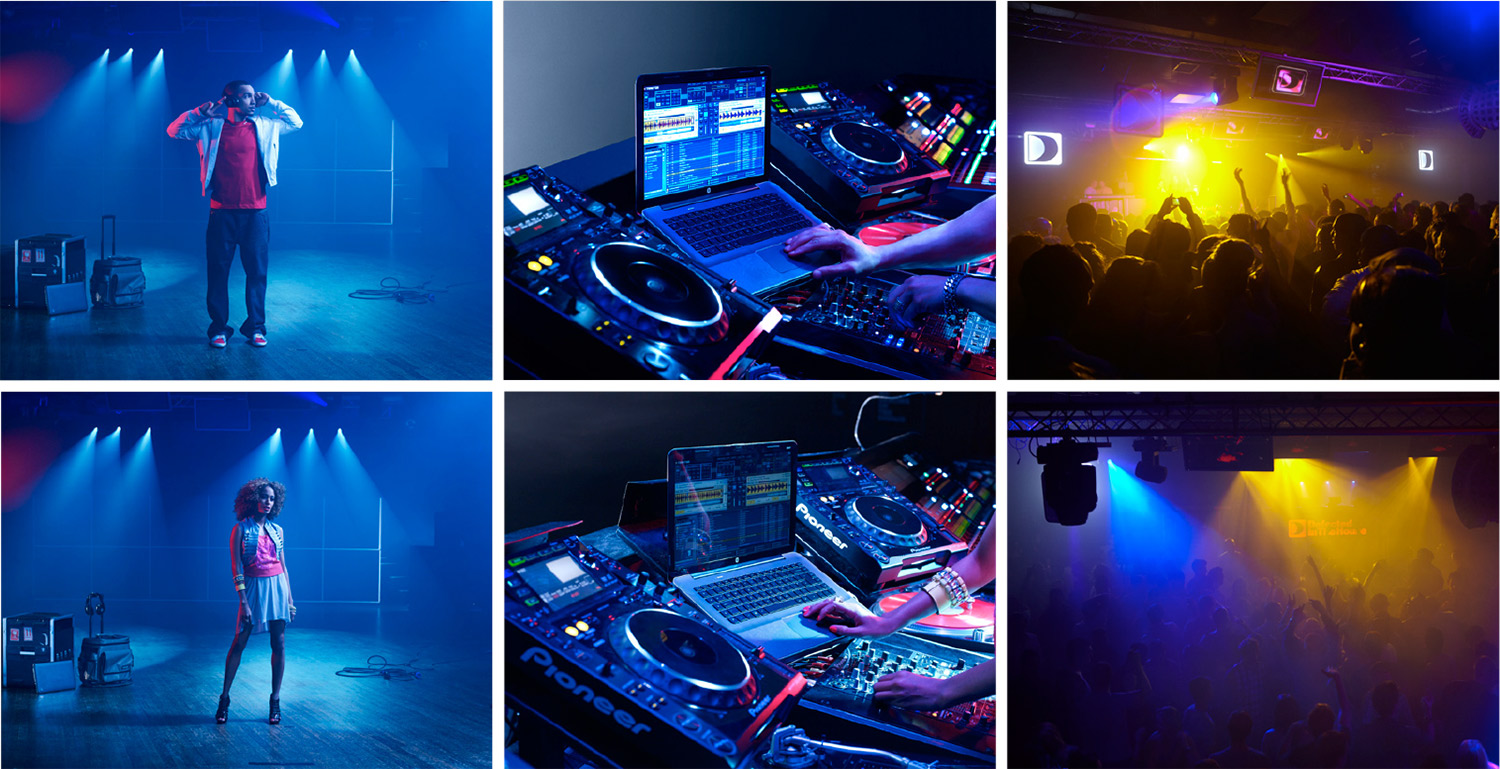
Owning color, defined by motion
As the world leader in printing, HP certainly had a powerful claim on owning color. But, more importantly, being just another “blue brand” in the technology space was death…the least interesting way we could come to life. So instead, we found a way to bring visual energy through the bold use of color into everything that we did from enterprise to consumer.


Coherence, not consistency
The entire design system, from use of color to scale of composition, needed to appropriately flex to the audience being addressed. By being crisp on the behaviors that supported the visual design system, we were able to create one of the most comprehensive, yet fully cohesive, visual design systems ever.